Considering this is an internal tool, please note that the final designs and concepts for the screens can't be shown online. The previous screenshot has already been published by the development company on their website.
Overview
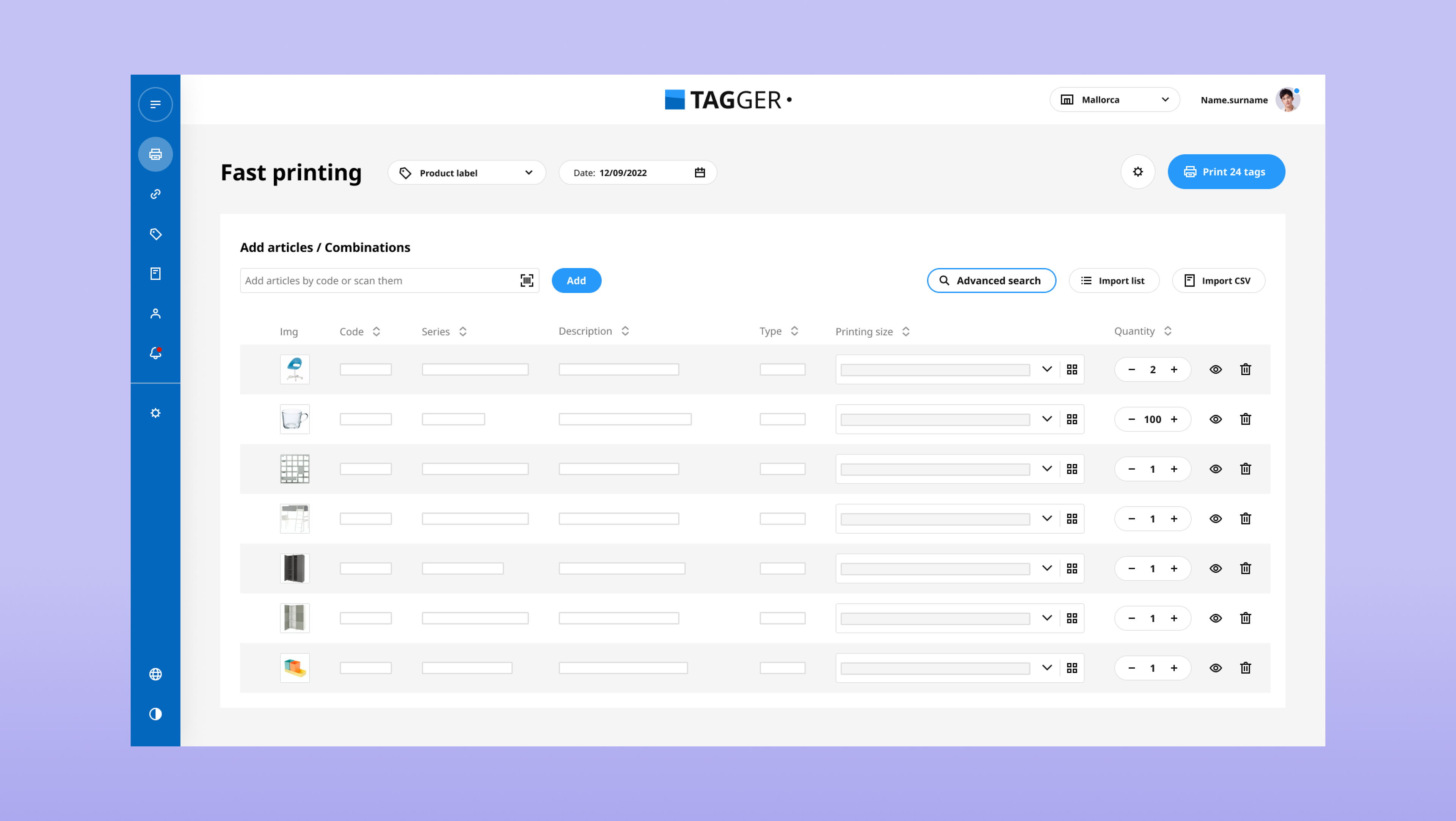
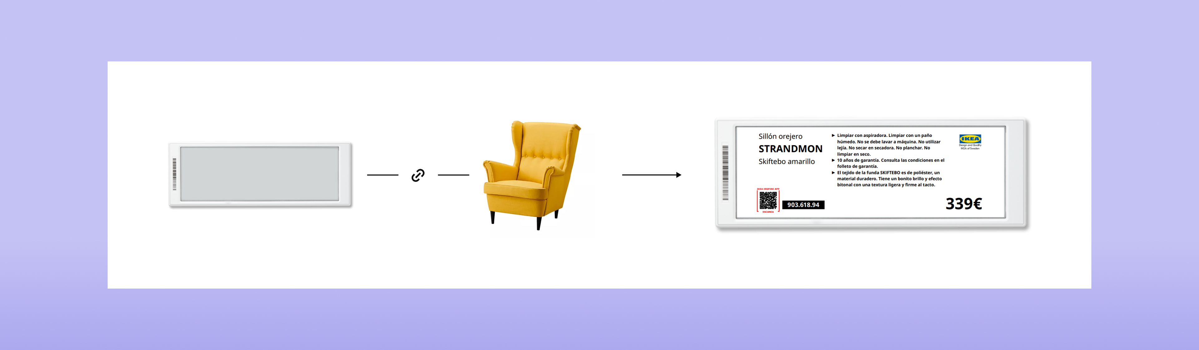
Tagger is an internal tool used in some IKEA stores to manage and print product and communication tags. Up until 2022, all tags were paper, but with the introduction of digital tags to the company, an updated version of the tool was required.
The new electronic tags demanded new workflows.
My role
Without a conventional PM, but with project management distributed among teams (mainly development), my role consisted of:
- Meeting with the development team to establish requirements and understanding technical needs
- Structuring the new app's information architecture and proposing user levels with different available actions
- Designing the necessary interfaces to manage and work with digital tags, and redesigning the existing ones
- Conducting research, alongside the research specialist of the UX team, to ensure that the digital tags workflow fit the current processes of the coworkers and was intuitive
- Iterating the design based on research results
- Working with the QA team to ensure that the design and user flows were implemented correctly
First steps
The first step was to fully understand the way that the new electronic tags worked, and what elements needed to be managed. For that, I had a meeting with the development team that was already testing the devices, and later did a little benchmark to see what other companies were doing with this technology.
Once I had a good grasp of how it worked, I conducted user interviews to understand their current workflow.
The challenge
Designing a workflow for a completely new process while maintaining consistency with the existing paper tags one.
The main insights
- They work in batches of products
- They have a medium to low level using digital tools
- The process will be done repeatedly
The solution
A step by step simple process of linking a single digital tag device with the product price it must display. Upon saving, the tag with its product and configuration will be added to the work list, which the user can save for later or review and send the final linking order if everything is correct.
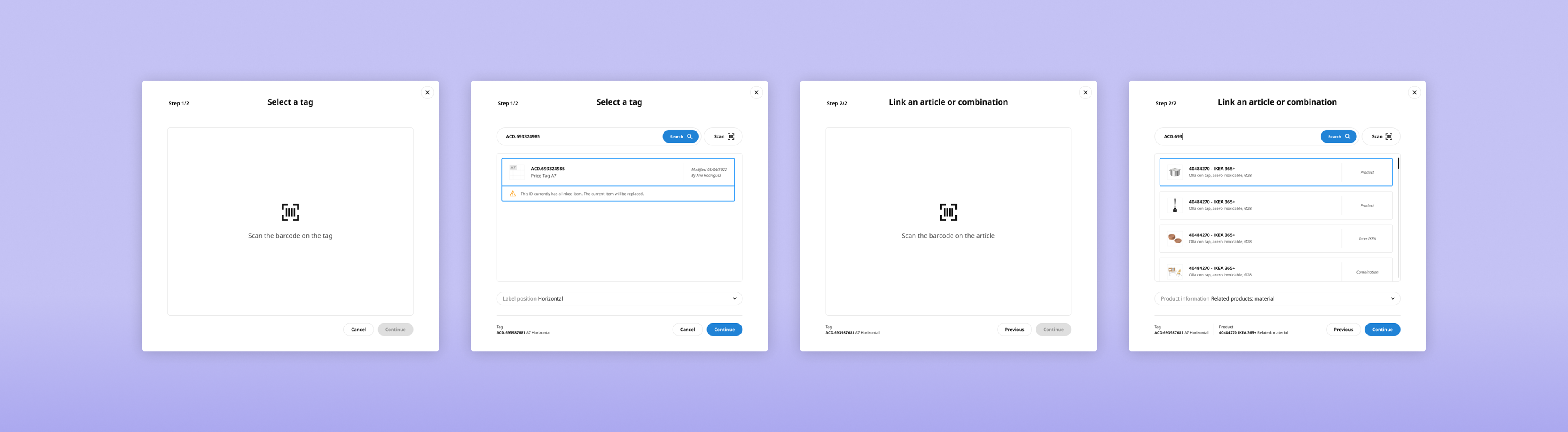
First linear process proposal using modals (discarded)
User test
With the research specialist leading the process, I participated in the qualitative user test. Since developers had been working on the new screen, we decided to conduct the test on the real product instead of working with our mockups on Useberry. We still used the research tool to conduct a previous questionnaire, and make a small card sorting.
My functions were:
- Creating the scenarios and tasks the users had to complete, to ensure all new functionalities were used.
- Preparing an introduction and explanation of the project, to make sure the selected coworkers understood both how the new digital tags and user testing work. This was presented by myself before conducting every test.
- In collaboration with my colleague, creating a document containing the whole testing process and extracted insights, valuable for other departments besides UX.
Reviews and iteration
Based on insights from the test, I redesigned some elements of the interface. It all had one main goal: give less information at first glance. Hide it to allow a faster workflow and only show it on demand.
Learnings
- Users on a fast-paced work environment, generally don't read the interface and work mechanically, only looking for further information when they need to solve a problem.
- Coworkers were glad to talk to the UX department and that their opinion and needs were heard. They showed a strong interest in the test and cooperated with us.
- User testing has impact far beyond the UX department, since we extracted conclusions even for how the physical tags were being handled at the store.