Starting point
Being an IKEA retailer means staying up to date with the IKEA guidelines.
While some elements are more often reviewed, the IKEA for businesses transactional mailings and newsletters were left a little behind. It was time for a review.
My role
Redesigning the emails and creating a guide to use the new elements, colors and renewed iconography given by IKEA.
Fist steps
Audit existing emails
To make sure that every need was taken in consideration, the first thing I did was audit existing transactional and newsletter emails.
Challenge #1
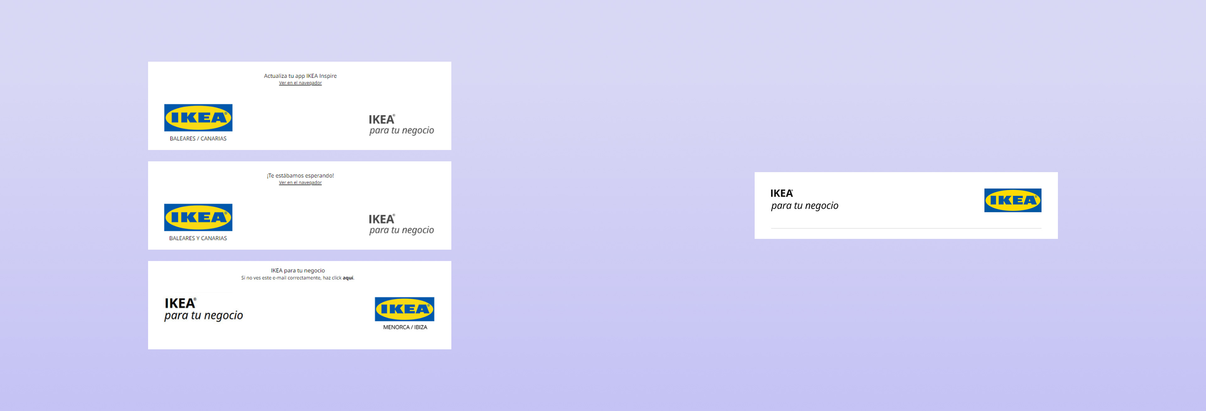
I found there were plenty of differences in the same sections depending on the email, we needed more consistency.
Solution
To avoid this unconsistency, the best approach was working on different modules that could be arranged and used independently depending on the communication needs.
While content modules could be modified, i decided that the header and footer would remain the same across all mailings, providing consistency.
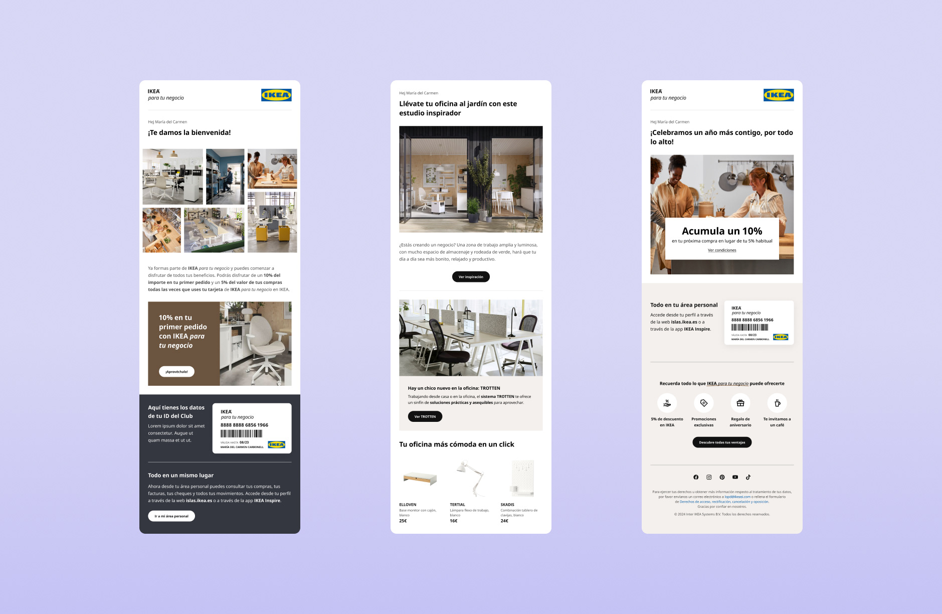
Before
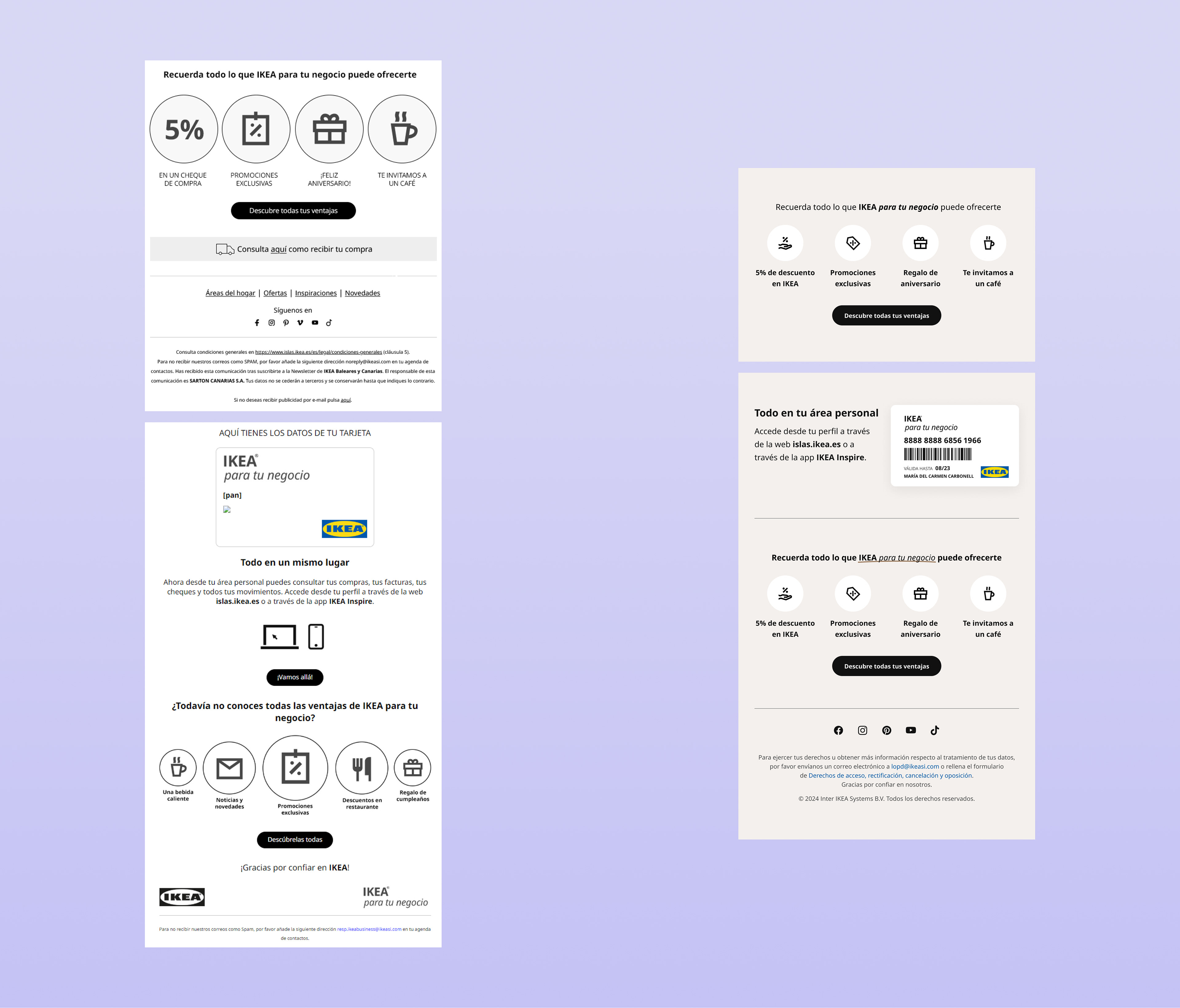
After
The process
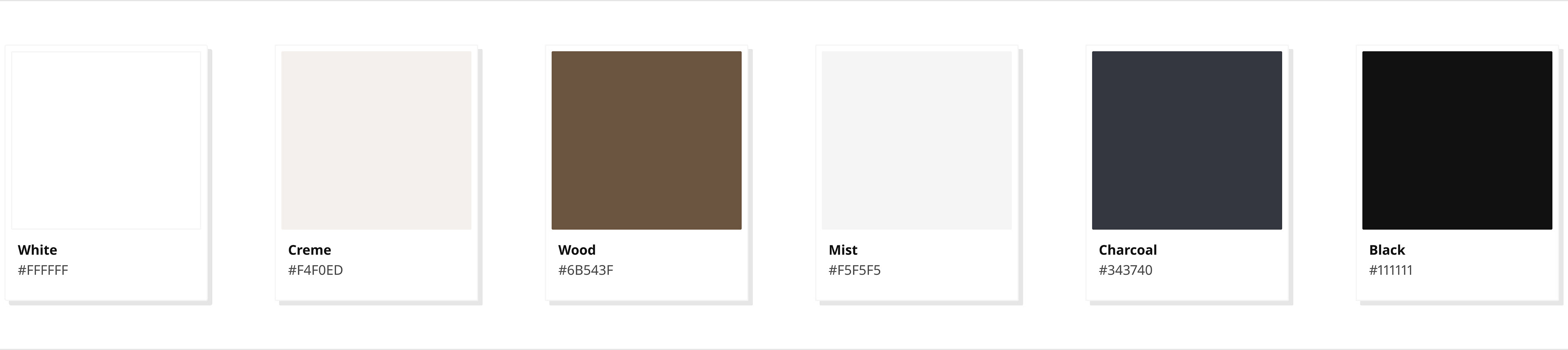
For the redesign, one of the things that i wanted to improve, was the all-white background. Together with the lack of a color palette, it gave de feeling of an unstyled email.
Challenge #2
Lack of color palette, the only base we had was IKEA's black color.
After diving into the problem talking with the content coordinator, I started looking for information around the "for business" guidelines in IKEA's toolbox. I found two patterns that were used in membership cards, consisting of a black fabric texture and light wood.
Solution
Crafting a color palette that fit into the guidelines while covering our specific market needs. With the pattern images as a refference, I created a palette where black was the main color, but not the only.
Before
After
-
-
-
The outcome
- Working with pre-designed modules saved time to the marketing team.
- The footer and card concepts and the color palette were proposed to be implemented in all areas related to IKEA for your business in our market.