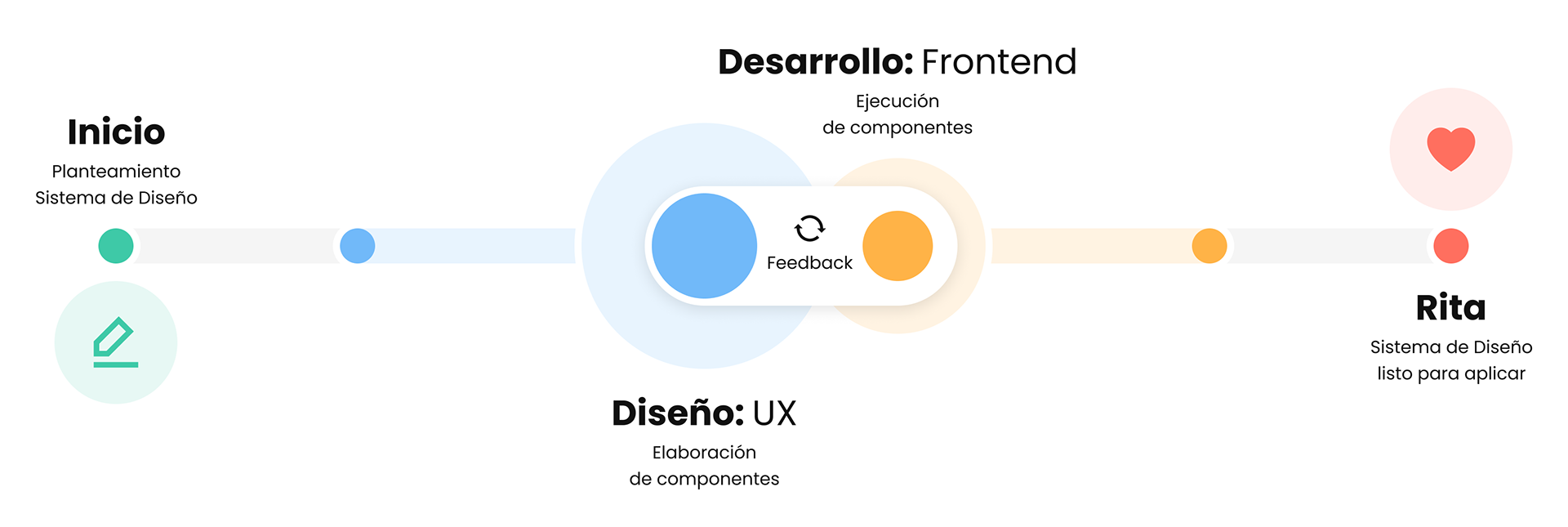
Starting point
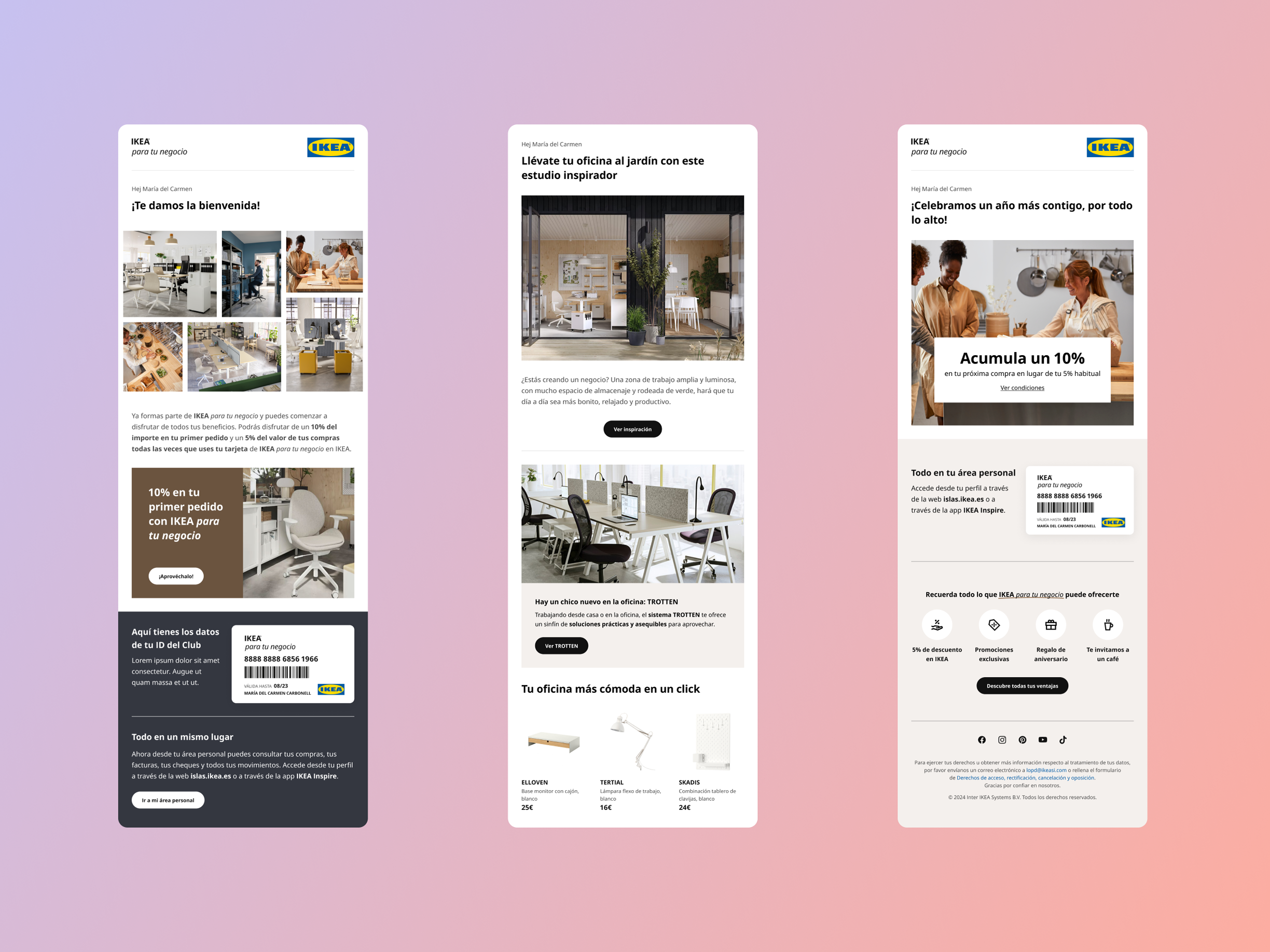
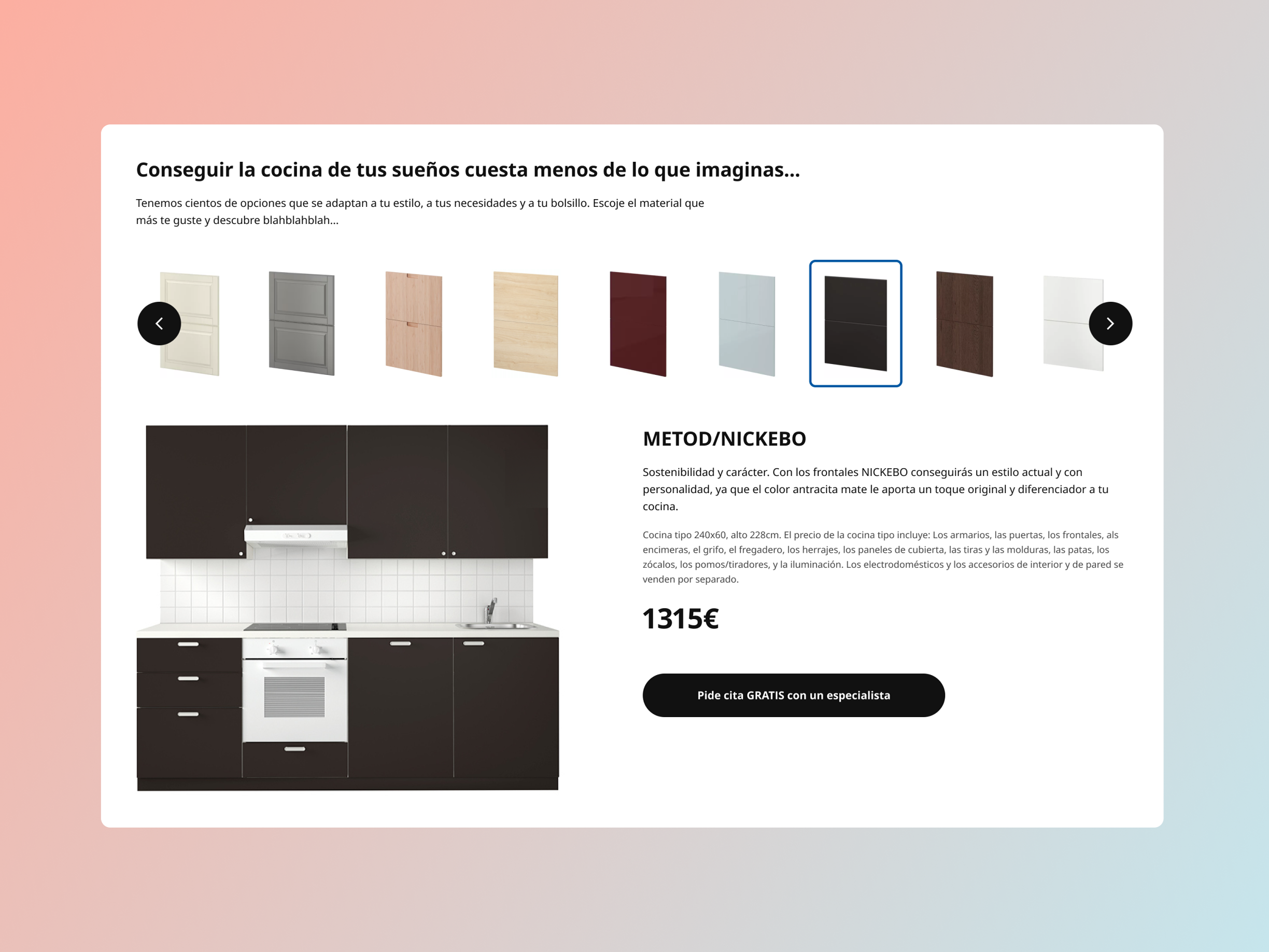
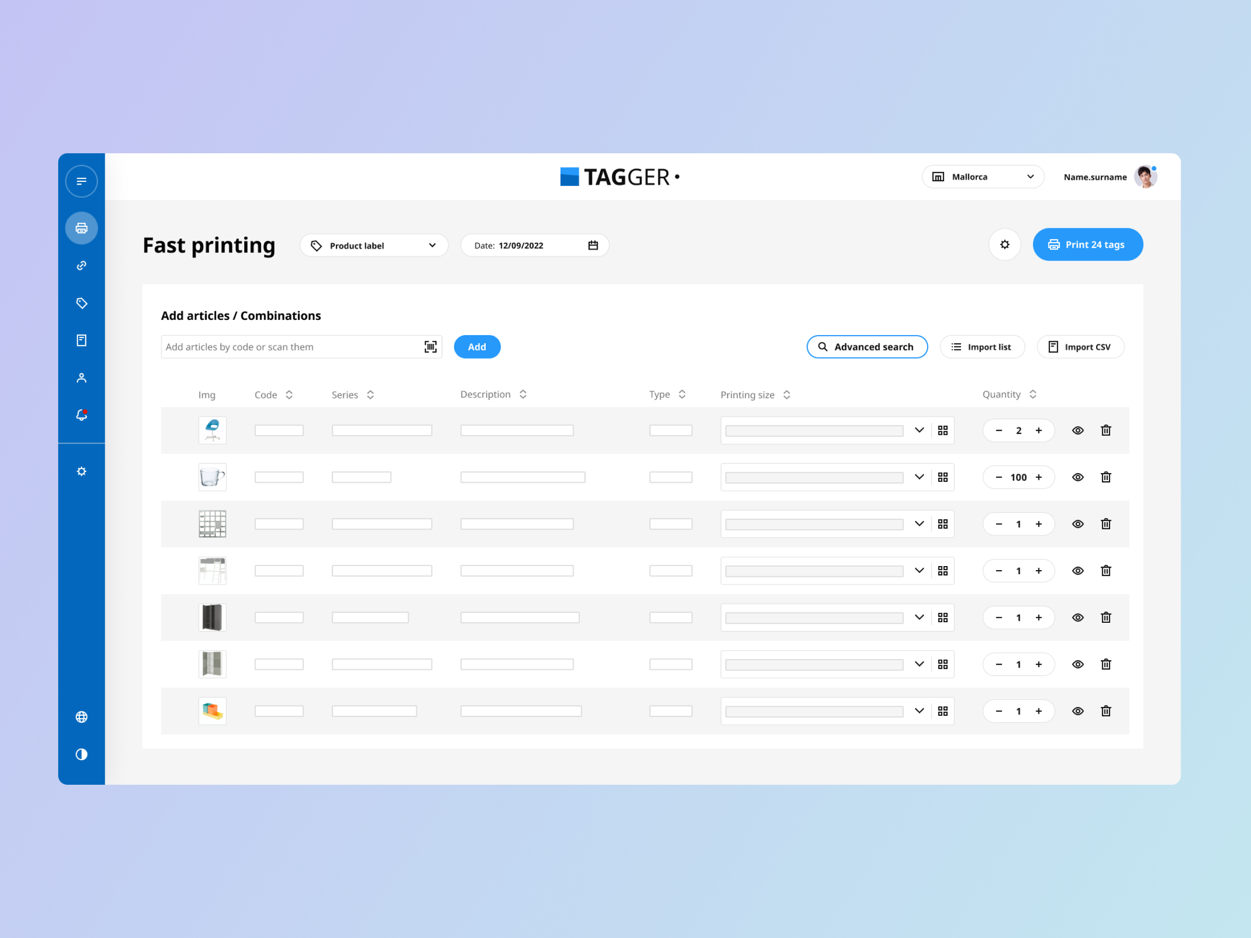
As an IKEA franchise, we were used to working with their design system, SKAPA. But our internal tools, specially those that were being sold to other franchises, had different styles and patterns.
We needed to unify them and be able to sell complete digital solutions with a unified look.
My role
Audit existing applications' elements, establish component needs, build Figma components, document components.
The team
Two designers (a colleague and myself) and one developer.
First steps
The first stage of the process was mainly communication with the development team. A lot of initial questions needed to be solved in collaboration: ¿what did they need from design deliverables? ¿which should be the first components? ¿how were Figma elements going to be related with their Storybook counterparts? ¿how were changes and updates going to be handled?
Organisation
The conclusions of how were we going to work were:
- 2 Figma files for the design part of the system: one for foundations (color, typography, icons, etc.), and one for components.
- 2 Figma files to deliver to the development team: one with each variant of the component (that would be linked to storybook) and one with components' specifications.
- Airtable to establish the order of priority for each component, show the design and development status and link to all the documents related to that component.
- Storybook to document de developed components
Foundations library
The first step was to create the design system's foundations. Each foundation element would have a 3 step process, divided among the 3 people participating in the project:
1. Define (UX Colleague): establish the foundation. For example, determine the tipography, its available colours and sizes.
2. Implement in Figma (myself): Create each style available in the Figma file and document it.
3. Implement in Storybook (Developer): using the Figma file as a reference, replicate the tipography styles in Storybook.
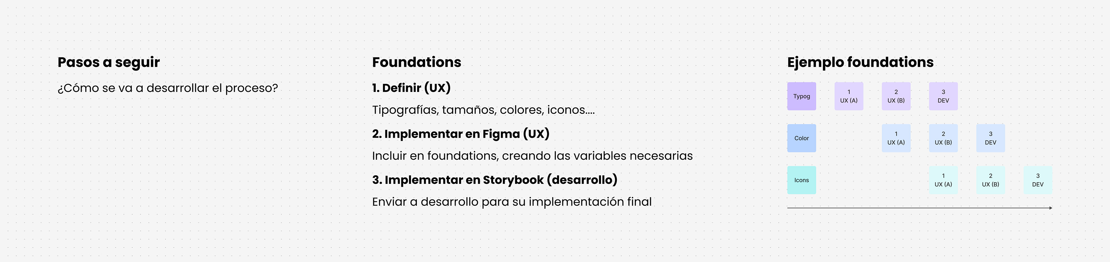
Foundations creation process
Components library
Once the foundations were established, it was time to prioritize and start building components. Bases on the Atomic Design principles, we started from the smaller and most relevant pieces: buttons. Then, the list would keep growing depending on our department's priorities or needs, since no development teem was using RITA yet.
The process for each component was the following:
1. Audit: annalyze each existing application and how it used the component at hand.
2. Establish needs: considering all types collected of the component, we'd diagram the final component's needs.
3. Design: design the final element, parting from the needed variants diagram and RITA's foundations.
4. Build Figma component: turn the design into a usable component, with variants and specific properties.
5. Document: create a page containing the specifications, to make the development process easier and more precise.
6. Develop: once the component and documentation was ready, it was time for the developer to do his magic.
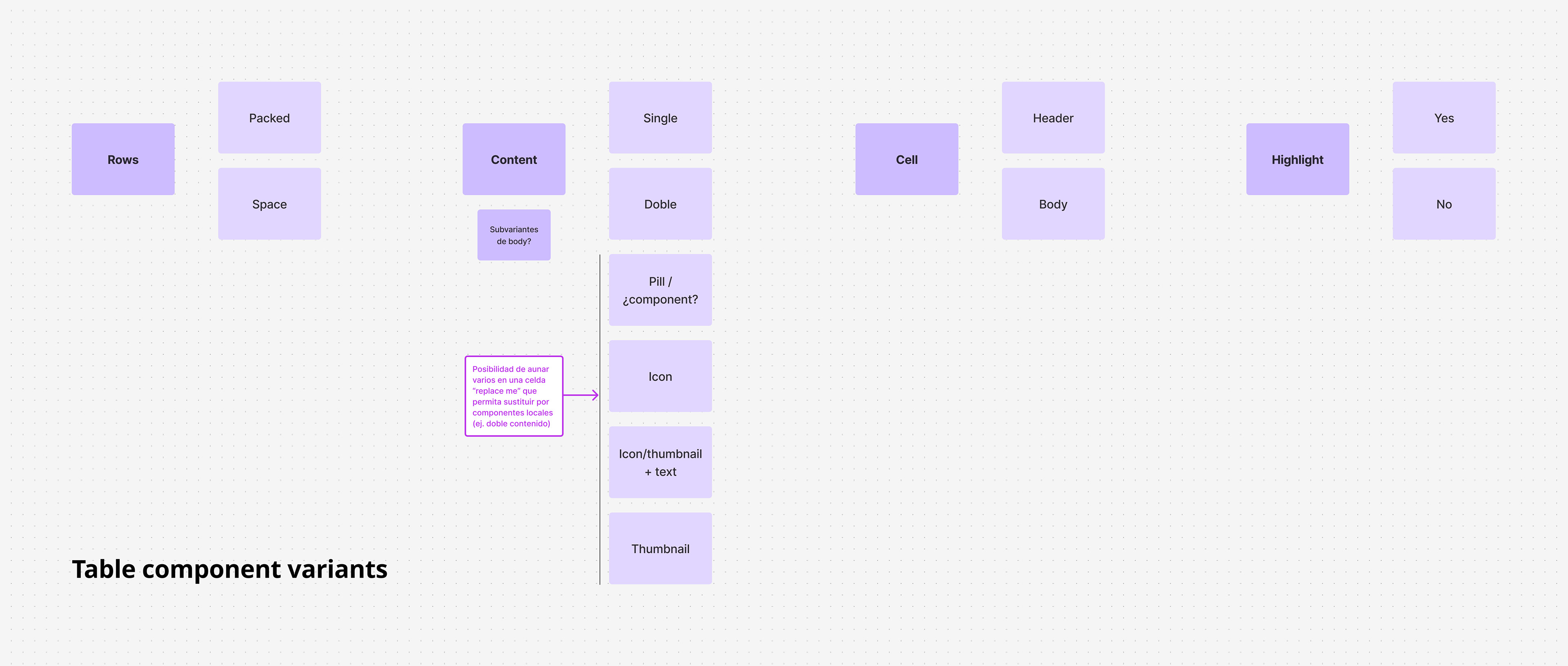
Example of step 2 - defining the table component variants
Conclusions
The system has grown and Figma has changed over the years, so we are working in a couple improvements:
- Turn all possible foundations into variable tokens
- Improve the usability of components through the new Figma properties and variants
- Reduce the number of figma files
- Improve accessibility